Unit 1
The language of art
Learn the shared words artists use (line, shape, colour, texture, balance and contrast) and use them on purpose in your own composition.
Read
The words artists share
Two friends, Zoya in Lucknow and Mateo in Mexico City, have never met. Each is asked to paint "a quiet evening". Zoya paints a few long horizontal lines of blue and violet with one small yellow window. Mateo paints a big dark square with a tiny glowing circle in a corner. Their paintings look nothing alike, yet when they video-call and talk about them, they understand each other at once. Zoya says, "I used long calm lines and one spot of warm contrast." Mateo says, "I used a heavy dark shape and a small bright one to balance it."
They can do this because artists share a vocabulary. Learning it does not make your work less your own. It gives you words for what your eyes already notice, so that you can choose on purpose instead of by luck.
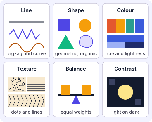
Artists usually sort the vocabulary into elements (the things you make marks with) and principles (the ways you arrange them). This unit uses four elements and two principles.
The elements
Line is the path a moving point leaves. A line can be straight, jagged, curved or broken. It can be thick or thin, bold or faint. Lines carry feeling: long horizontal lines feel calm and still, like a horizon; sharp zigzags feel tense and energetic; slow curves feel gentle. A line can also be an edge, where one area stops and another starts.
Shape is a flat area closed in by an edge or by a change of colour. Squares, circles and triangles are geometric shapes. A leaf, a puddle or a cloud is an organic (free-form) shape. When a shape looks solid, with depth, artists call it a form; you met that idea in perspective.
Colour has three things you can control. The hue is the name of the colour (red, blue, green). The value is how light or dark it is (pale pink to deep maroon are the same hue at different values). The intensity is how bright or dull it is. Warm colours (reds, oranges, yellows) seem to come forward and feel lively. Cool colours (blues, greens, violets) seem to sit back and feel calm. Colours opposite each other on the colour wheel, such as blue and orange, make the strongest pairing.
Texture is how a surface feels, or how it looks as if it feels. Actual texture is real: sandpaper, a thick dab of paint, a woven cloth. Visual texture is drawn: tiny dots for the skin of an orange, short strokes for fur, crosshatching for tree bark. You can make a flat paper look rough, soft or shiny just by the marks you choose.
Try it: Pick up three things from your desk. Draw a patch of each one's texture in a square about 4 cm wide, using only a pencil. Use dots, lines or scribbles. Can a friend match each patch to the object?
The principles
Balance is the feeling that the weight of a picture is steady and nothing is about to tip over. Every shape has visual weight: big, dark, bright, rough and complex things feel heavier; small, pale, plain things feel lighter. There are three common kinds of balance.
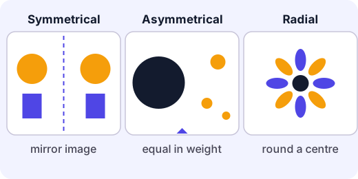
- Symmetrical balance mirrors one side onto the other, like a butterfly, a temple facade or a Persian carpet. It feels formal, calm and steady.
- Asymmetrical balance has different things on each side, but they carry the same visual weight. Think of a seesaw: a heavy child sitting near the middle can balance a lighter child sitting far out. In a picture, one big dark shape near the centre can be balanced by a small bright spot far away at the edge. It feels natural and lively.
- Radial balance repeats parts around a central point, like a rangoli, a flower or a wheel.
Contrast is a strong difference between two things placed together: light against dark, rough against smooth, big against small, warm against cool, curved against straight. Contrast tells the eye where to look first. A yellow lamp glowing in a dark window is the first thing you see because the contrast there is the strongest.
A worked example
Example. Ravi wants a poster for a school kite festival. He starts with the empty page and makes choices, one element at a time.
- Shape. He draws one big diamond kite in the upper left, a geometric shape that is easy to recognise.
- Colour. He paints the kite orange and the sky deep blue. These are opposite on the colour wheel, so the kite looks like it glows.
- Line. He adds a long curved line, the kite string, sweeping from the kite down to a small figure at the lower right. The curve leads the eye across the page.
- Texture. He dabs a sponge across the sky so it looks like thin cloud.
- Balance. The big, bright kite is heavy, so the page would tip to the left. He checks: the small figure at the lower right is light, but it is far from the centre and it has a bright red cap. Squinting at the poster, the two sides feel steady. That is asymmetrical balance.
- Contrast. The strongest contrast on the page, bright orange on dark blue, is exactly where he wants people to look: the kite.
Notice that Ravi did not "add" balance at the end like a sprinkle. He judged it by looking, and adjusted.
Common mistakes
- "Balance means symmetry." No. Symmetry is one kind of balance. Many of the most interesting pictures are asymmetrical and still feel steady.
- "More contrast is always better." No. If everything contrasts with everything, the eye has nowhere to rest. Good work uses strong contrast in one place and quieter areas elsewhere.
- "Colour just means choosing nice colours." Hue, value and intensity are three separate choices. A picture made only of mid-value colours can look dull even if each colour is beautiful, because it has no light-dark contrast.
- "Texture means it has to be bumpy." Visual texture is drawn, not felt. A smooth page can show a rough bark.
Using the words to look
Take any image you like: a painting, a poster, a photograph, a sari border, a temple carving. Ask six questions. What kinds of lines lead my eye? What shapes repeat? What do the colours feel like? What textures can I see or imagine? Is the picture balanced, and in which way? Where is the strongest contrast, and what is there? Answering them takes a minute and changes how you see.
When you make your own work, the vocabulary becomes a set of knobs you can turn. If a picture feels flat, try raising the contrast. If it feels restless, calm it with longer lines and quieter colour. If it feels lopsided, move a light shape farther out or darken a small one. Make a change, step back, look again. That is how artists work.
Activity
Two compositions, one subject
Make the same simple scene twice, first with symmetrical balance and then with asymmetrical balance, choosing line, shape, colour, texture and contrast on purpose. About 60 minutes.
You'll need
- 2 sheets of plain paper (A4 or similar), or one folded in half
- Pencil and eraser
- Colour: crayons, pencil colours, poster paint or cut paper from old magazines
- Scissors and glue if using cut paper (adult help for younger siblings)
- Optional: a coin, leaf or cloth to make texture rubbings
Steps
- Choose a simple subject you can see in your head, such as a tree beside a house, a kite in the sky, a boat on water or a lamp in a window. Write it at the top of a notes page.
- Composition 1, symmetrical. Draw a very light vertical line down the middle of the paper. Plan the picture so the left and right sides are close to mirror images. Use at least one shape of each kind: geometric and organic.
- Add line on purpose. Choose one line quality (for example long, calm horizontals) and use it for the main structure. Add a different kind of line (a jagged one, a curved one) in one place only.
- Add colour on purpose. Choose two main hues, one light value and one dark value. Keep one small area of a colour opposite to your main colour for contrast.
- Add texture. Make at least two different textures, drawn (dots, hatching, short strokes) or real (a rubbing of a leaf or coin, scraps of cloth or paper).
- Composition 2, asymmetrical. On a new sheet, make the same subject again, but do not mirror it. Put one large, dark or busy shape off-centre, then balance it with something smaller or lighter placed farther from the centre. Check by squinting, or by holding the page up to a mirror: does it feel steady, or does it tip?
- Under each picture, write three short sentences. Name where the strongest contrast is and why you put it there. Name which element you used for the main mood (for example "long lines for calm"). Say which kind of balance it is and how you can tell.
- Show both pictures to someone at home or in class without saying anything. Ask them where their eye goes first, and write down what they say. Compare it with where you wanted it to go.
Safety
- Scissors are sharp; cut away from your body and put them away when done.
- Use non-toxic paints and glue, and wash hands afterwards. Do not put brushes or crayons in your mouth.
- Cover the table if using paint, and let pictures dry flat.
Keeping a log of the activity is for registered learners. Register to do this.
Quick check
Elements and principles check
Eight questions about the shared language of art. Look at the pictures carefully.
1.In this picture, which idea is mainly responsible for the red circle catching your eye first?
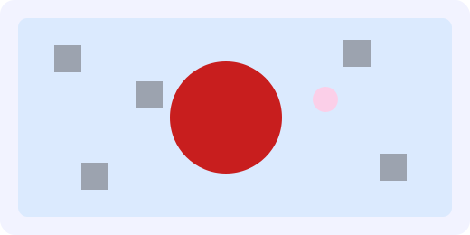
- Contrast: it differs strongly from its surroundings in size and colour
- Symmetry: both sides are mirror images
- Texture: it looks rough
- Line: it has a long curved outline
Choose one
2.Match each word to the description that fits it best.
- Line
- Shape
- Colour
- Texture
Match each to: The path left by a moving point, such as a zigzag · Hue, value and intensity · A flat area closed in by an edge, such as a circle or a leaf outline · How a surface feels, or looks as if it feels
3.Which one is an example of asymmetrical balance?
- Two identical windows, one on each side of a door
- A large dark rock near the centre-left, balanced by a small bright red boat far out on the right
- A flower with eight identical petals
- A big dark shape on the left and nothing at all on the right
Choose one
4.Which of these create contrast? Pick all that apply.
- A small bright yellow shape on a dark navy background
- A rough scribbled patch next to a smooth flat area
- Ten circles of the same size and colour spaced evenly
- One huge tree beside a tiny hut
Choose all that apply
5.A pale pink and a deep maroon are the same hue. What is different between them?
- Their value (how light or dark they are)
- Their hue
- Their texture
- Their shape
Choose one
6.Put these colours in order of contrast against a white page, from the weakest contrast to the strongest.
- Very pale yellow
- Black
- Dark navy blue
- Bright orange
Put these in order
7.A student draws a hedgehog with many short, sharp strokes so the animal looks prickly to touch. Which element of art is this? (One word.)
Answer with a word or phrase
8.Both posters say BOOK FAIR. A teacher says Poster A is hard to read from the back of the hall. Which is the best explanation and fix?
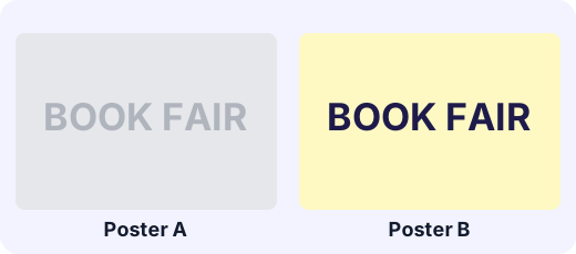
- Poster A has too little light-dark contrast; use dark letters on a light ground, as in Poster B
- Poster A is not symmetrical; add a mirror image of the title
- Poster A needs more texture; add dots to the letters
- Poster A needs thinner lines; make the letters narrower
Choose one
Answering and checking are for registered learners. Register to do this.
Quick check
New puzzles
Use the vocabulary in situations you have not seen before.
1.A rangoli has eight identical petals arranged all the way round a central dot. What kind of balance is this?
- Radial balance
- Asymmetrical balance
- It has no balance
- Contrast
Choose one
2.A road sign must be read quickly from far away. Which colour pairs (letters on background) give strong contrast? Pick all that apply.
- Yellow letters on black
- White letters on dark green
- Light grey letters on white
- Dark red letters on maroon
Choose all that apply
3.A seesaw balances when (weight) x (distance from the middle) is the same on both sides. A 30 kg child sits 2 m from the middle. How far from the middle, in metres, must a 20 kg child sit to balance? (Artists use this same idea for the visual weight of shapes.)
Answer with a number
4.A painter's picture has a big dark rock on the left and feels lopsided to the left. Which change is most likely to help?
- Add a small bright shape far out on the right
- Add a second dark rock right beside the first
- Make the left rock even darker
- Rub out the right-hand side of the page
Choose one
5.You paint a flat sky with a smooth, even layer of blue. Which action adds visual texture, like thin clouds?
- Dabbing a dry sponge over the wet blue and lifting it off
- Drawing a straight border around the page
- Copying the left half onto the right half
- Making the whole page a larger size
Choose one
Answering and checking are for registered learners. Register to do this.
Your turn
Explain a picture with the shared words
Choose one picture you like (a painting, poster, photograph, textile or carving, or one of your own pieces from the "Two compositions" activity). Say what it is in one line, then write about it:
- Name two elements (line, shape, colour or texture) and describe exactly how each is used in the picture. Use words like zigzag, curved, geometric, warm, pale, rough, dotted.
- Say whether the picture uses symmetrical, asymmetrical or radial balance. Explain how you can tell, and what carries the "weight" on each side.
- Point to the strongest contrast in the picture. What is contrasting with what, and why do you think the artist put it there?
- Name one thing you would change to give the picture a very different mood. Say which element or principle you would change and how.
How it's judged
- Using the vocabulary accurately
- Reading balance
- Contrast and purpose
- Proposing a change
Writing and submitting your answer is for registered learners. Register to do this.
Like what you see?
Register for free to answer the quick checks, do the activities and save your work. Your work is saved on your device and syncs to your account.